Nearly 80% of donors abandon donation forms before completing their gift, but your form doesn’t have to be one of them.
Today’s donors expect speed, ease, and security when giving online, just like they do when shopping or paying a bill. That’s why DonorPerfect donation forms deliver a modern, mobile-optimized experience—while giving you the tools to track campaigns and strengthen relationships.
Included in all DonorPerfect plans, these upgraded fundraising forms can help you raise more money with no extra cost or add-ons. Here’s how.
Drive more giving with modern donation forms
Whether it’s year-end, GivingTuesday, a major donor campaign, or everyday contributions, your online form should be responsive and easy to use. This builds trust with donors who are giving online for the first time, are nervous about where their money is going, or have had negative experiences in the past.
With DonorPerfect donation forms, supporters can give quickly and conveniently from any device. And with trusted payment options like PayPal and Venmo, alongside credit card and bank transfer, donors can choose the method that feels most secure to them. Enabling these popular payment choices signals that their information is protected and their gift is in good hands.
When Enough Abuse received a shout-out from an Instagram influencer, their supporters responded immediately, giving $6,291 in just four days. A mobile-friendly donation form with frictionless payment options like PayPal and Venmo made it possible for supporters to give the moment they felt inspired.
“All those gifts came from people giving on their phone.” – Lindsay H., Communications Coordinator
Extend your donor experience beyond the appeal
Every fundraising campaign is powered by a story, such as a heartfelt appeal or a challenge from a trusted influencer. The impact of that story shouldn’t end at the call to action.
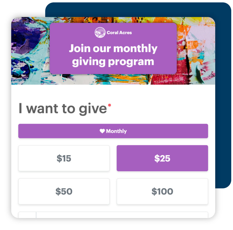
For example, fundraisers can customize DonorPerfect donation forms to mirror the energy and tone of their campaigns, so they feel cohesive with the donor communications they send. Our customers leverage impactful visuals, persuasive messaging, and brand-specific elements to make their forms feel like a seamless extension of their outreach.
Every DonorPerfect plan includes high-converting, mobile-friendly donation forms. They give your donors a seamless donation experience and help you raise more money, with no extra costs or add-ons.
See how our donation forms and fundraising CRM work together to grow your giving year-round.

Use your donation form to build deeper donor trust
Your donation forms can help reinforce your nonprofit’s credibility and values. They’re an opportunity to show consistency, care, and attention to donor experience. When your fundraising forms match your organization’s look and language, it reassures donors they’re in the right place and that their gift matters.
You can show impact examples directly on the form to illustrate how contributions will be used. For example, $20 provides lunch for 5 students. Carry that same message through to your thank-you message (e.g., This week, 5 students enjoyed lunch thanks to your generosity. Because of you, they can focus better in class.). This consistency between giving and follow-up assures donors that their donation makes a tangible difference, strengthening both loyalty and trust.
Offer a friction-free giving experience
Donors give more when the process feels effortless. A well-designed, mobile-optimized form eliminates extra clicks and distractions so supporters can complete their gifts quickly.
What supporters love:
- Fewer clicks – Complete gifts fast
- Mobile-friendly design – Donate from any device
- Convenient payment methods – Give via credit card, bank transfer (ACH/PAD), PayPal, or Venmo (U.S. only)
- Flexible giving options – Choose one-time or custom monthly giving for budgeting
- Accessibility features – Complete donations without barriers
- Dedication gifts – Honor or remember someone, with an emailed or mailed notification
- Corporate gifts – Make a contribution in a company’s name
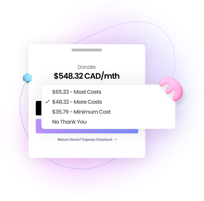
- Optional fee coverage – Cover processing fees
- Instant gratitude – Receive automated thank-you emails
- Social sharing – Share a clear, recognizable URL with ease
Guide supporters to give with confidence
The right tools make it easy for fundraisers to create compelling, high-converting forms that inspire generosity and simplify gift tracking.
What fundraisers love:
- Drag-and-drop builder – Create, customize, and publish online forms in minutes
- Consistent branding – Match exact colors with the eyedropper tool, plus include fonts, images, videos, or logos
- Custom URL – Share a branded, campaign-specific link (e.g., neighbors.org/feedfamilies)
- Impact statements – Show how each gift makes a difference
- Suggested giving amounts – Include preset donation levels to guide supporters toward recurring giving
- Field types – Choose from dropdown, text, checkbox, and memo fields
- Hidden codes – Assign campaign, solicitation, and general ledger codes to track gift sources
- Custom thank-you pages – Instantly thank donors with a post-donation message
- Preview mode – View the donor experience before publishing
Turn donations into lasting relationships
With DonorPerfect, every gift submitted through your forms flows directly into your system. Supporter details, gift data, and campaign codes are automatically organized in your CRM, giving you a complete view of every donor and dollar.
With this data, you can move from simple transactions to building relationships, while also keeping financial data accurate and actionable:
- Identify first-time donors and add them to a welcome email series through Constant Contact, included in all DonorPerfect plans
- Flag recurring donors for stewardship, recognition, or upgrade opportunities
- Segment donors for major gift appeals or monthly giving campaigns
- Spot trends in payment methods, average gift size, and campaign performance
- See exactly how much you raised and simplify reconciliation
Ready to start raising more money with DonorPerfect donation forms?
Explore all the easy-to-use features >>

Build and publish forms in minutes
DonorPerfect makes it easy to design online forms tailored to any campaign or initiative. With the intuitive drag-and-drop builder, you can respond quickly to time-sensitive opportunities like a sudden match challenge or a viral social media moment, without coding or waiting on web development.
“The new donation forms are great and user-friendly.” – Gina F., Senior Development Specialist
Keep donors coming back to give again
Your donation form is a step toward lasting donor relationships. By making every online interaction smooth, branded, and meaningful, you build trust with your supporters.
But fundraising forms are just the start.
To keep donors engaged long after their first gift, you need a thoughtful approach that nurtures relationships over time. Our free guide, Donor Engagement Models for the Digital Age, shows you how to turn one-time givers into loyal supporters using data, segmentation, and automated touchpoints that work hand-in-hand with your donation forms. Get your copy today.


